The client
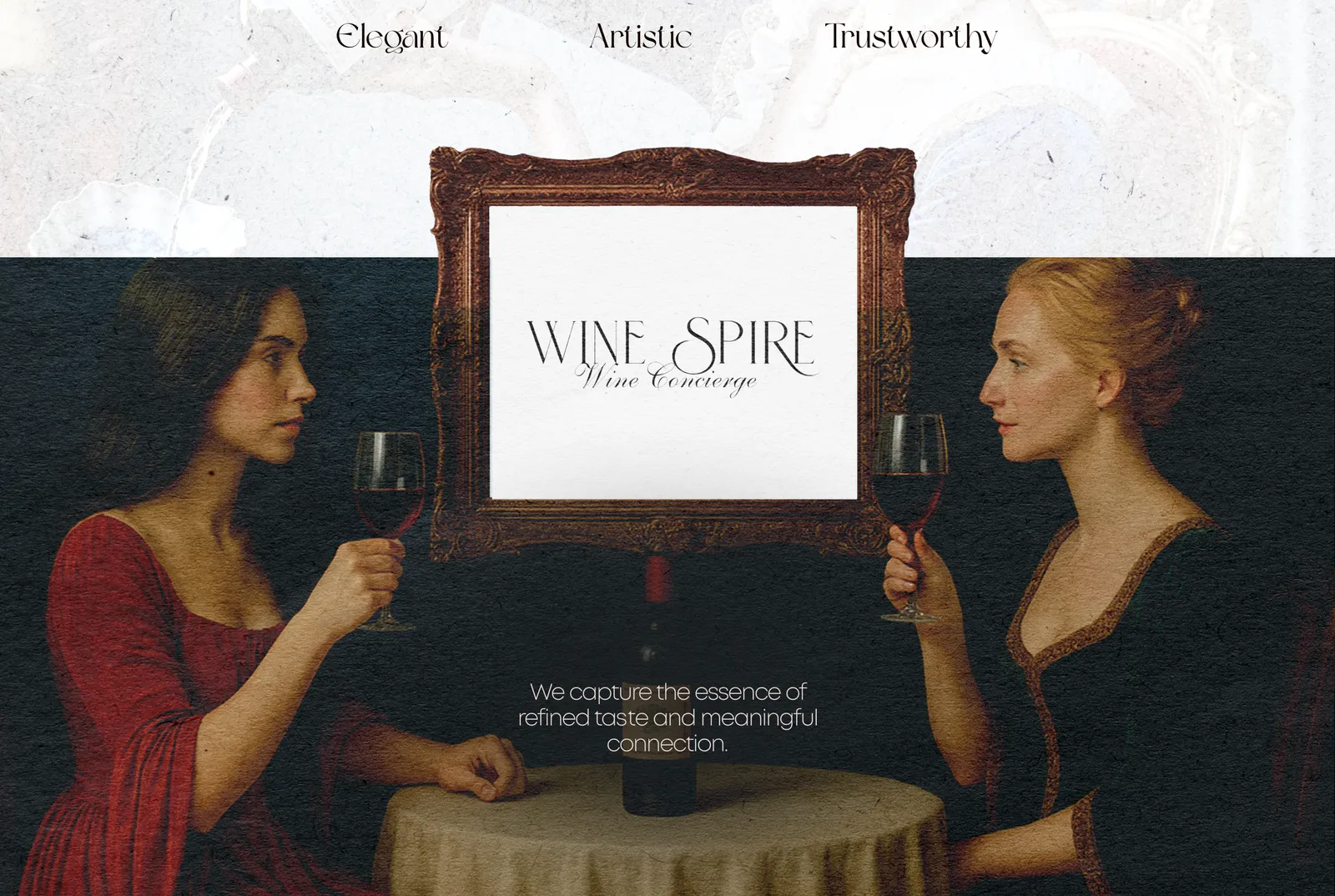
WineSpire is a Florida-based wine concierge and distributor. It connects boutique wineries from around the world with the U.S. market, from Old World classics (France, Italy, Spain, Portugal, Germany, Austria) to New World icons (California, Oregon, Washington, Argentina, Chile, Australia, New Zealand, South Africa).
The brand had to merge the artistry of wine with modern luxury service. We defined its character in three words: elegant, artistic, trustworthy.
The brand idea
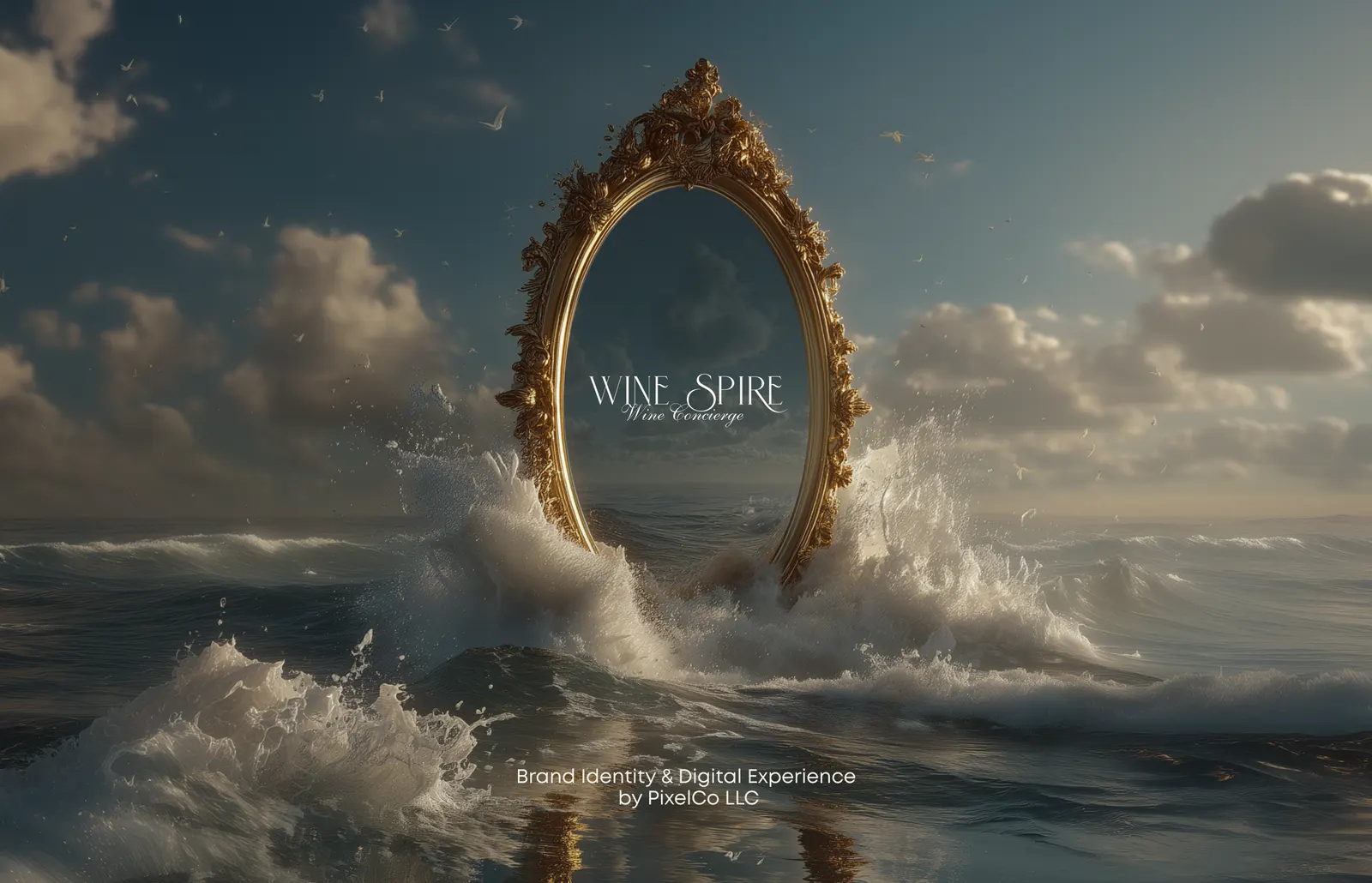
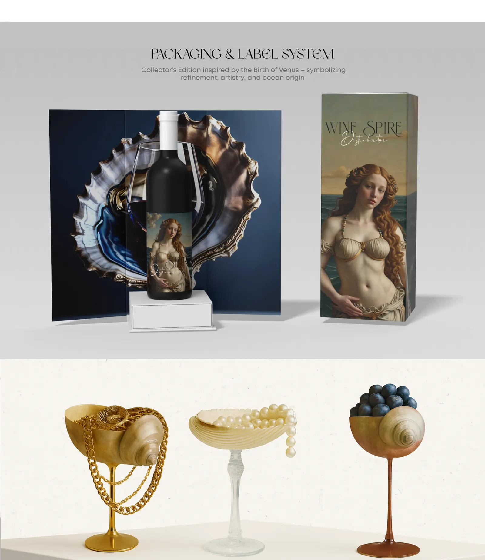
The whole identity grows from one image: beauty born from the ocean, in the spirit of Botticelli’s Birth of Venus. Shells, gold, deep water and classical painting give WineSpire a look that feels like fine art rather than a typical wine label, and makes it instantly recognizable next to other distributors.
Logo system
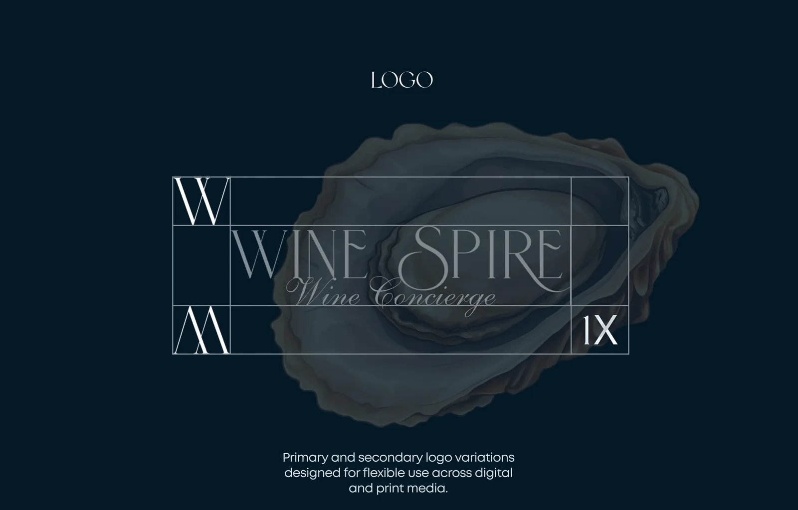
A fine, high-contrast serif wordmark with a calligraphic “Wine Concierge” line, plus a compact WS monogram. Primary and secondary versions let the logo work everywhere, from a bottle label to a website header and a social media avatar.
Color palette and typography
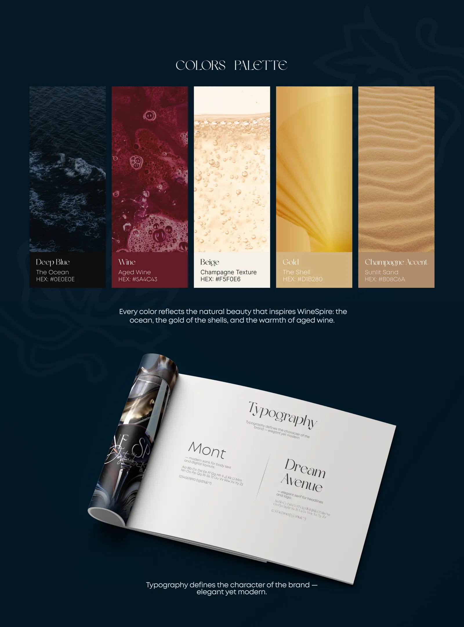
Every color comes from the natural beauty behind the brand: the ocean, the gold of the shells and the warmth of aged wine.
The typography pairs Dream Avenue, an elegant display serif for headlines, with Mont, a clean modern sans for text. Together they read as classic and contemporary at the same time.
Packaging and label system
A Collector’s Edition inspired by the Birth of Venus: a dark bottle with an art label, a matching gift box and shell-shaped glassware for presentations. The packaging carries the ocean story straight to the customer’s table.
Print and brand applications
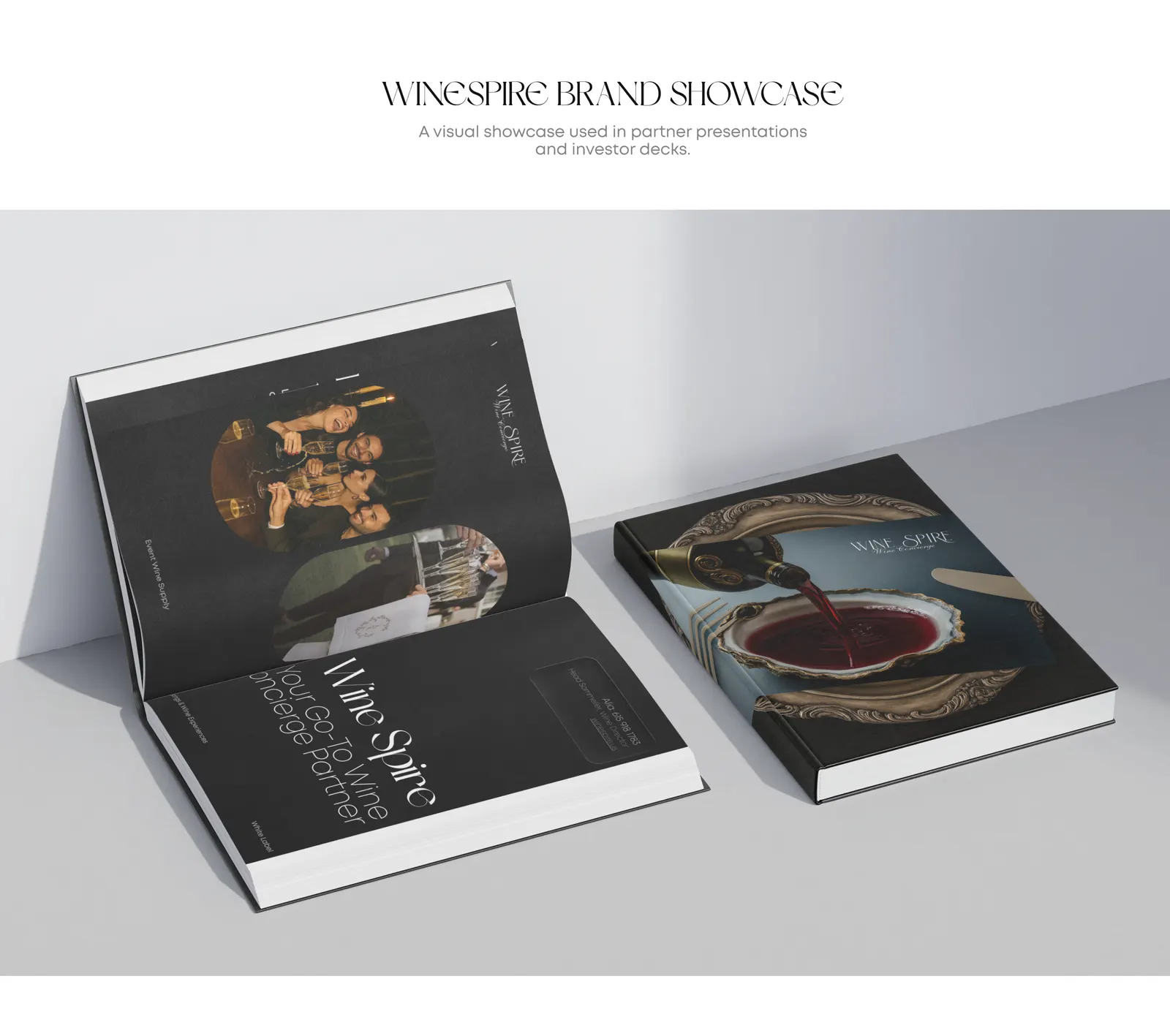
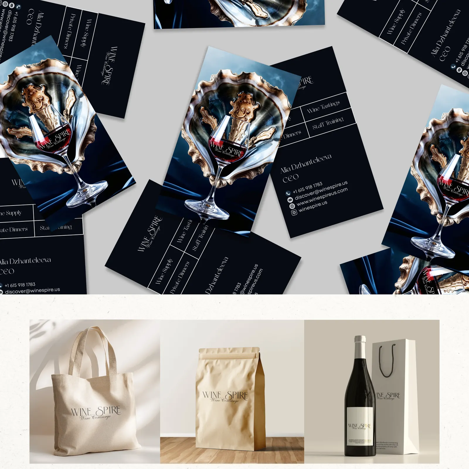
A brand showcase book for partner presentations and investor decks, business cards, a tote bag, coffee packaging and wine bags. Everything uses the same navy, gold and shell imagery, so every touchpoint feels like one brand.
Website design
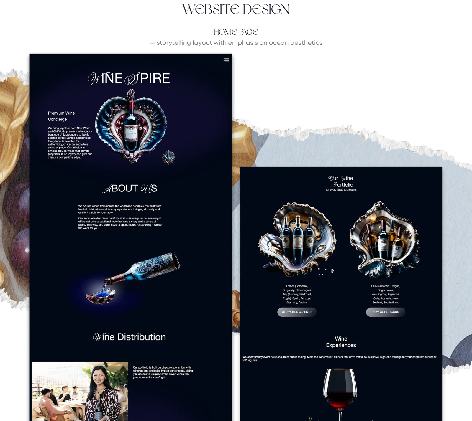
A storytelling home page with an emphasis on ocean aesthetics: the wine portfolio split into Old World Classics and New World Icons, wine distribution and wine experiences for corporate clients, all on a deep navy background with shell-and-bottle visuals.
The result
A timeless, artistic brand identity that places WineSpire in the world of fine wine distribution. One consistent system now covers the logo, packaging, print, website and social media.
Building a premium brand? See how we approach branding.
FAQ
What does a wine brand identity include?
For WineSpire it covered the primary and secondary logo, a five-color palette, a typography pair, a packaging and label system, a brand showcase for partners and investors, business cards, merch, social media assets and the website design.
How do you make a wine brand look premium?
By building it around one strong idea and carrying it through every touchpoint. WineSpire's idea is the ocean origin of beauty: a deep navy base, gold taken from the shell, aged-wine red and champagne tones, a fine serif logo and art-inspired imagery.
Can the same branding work for print and digital?
Yes. We designed the logo in primary and secondary versions specifically so it holds up on labels, packaging and business cards as well as on the website and social media.